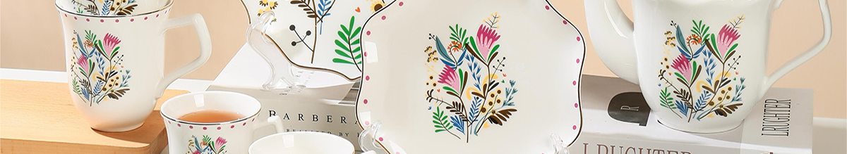
The color of ceramic plates can really change how we experience our food, making eating feel more engaging for all our senses. When plates create interesting contrasts against different foods and their colors, it just makes everything look better on the table. According to some research published in 2023 by Business.com, around two thirds of people who eat out think that when restaurants pick plate colors carefully, they end up thinking the food tastes better too. Regular white or black plates are fine, but plates in bright colors such as warm terracotta or soft sage green give cooks and servers so much more freedom. These colorful options work great whether the restaurant wants to go for something super modern or something more farmhouse style.
Ceramic plates in warm colors like red and orange actually make people hungrier and feel more energetic during meals. On the flip side, blue and green plates tend to create a calmer dining atmosphere where folks take their time eating. A study published in Flavour Journal back in 2022 found something interesting too. When researchers served exactly the same food on round plates with earthy tones versus plain square white ones, diners said the food tasted almost 20% better. So there's definitely something going on with how plate color and shape affect our taste experience. Restaurants probably should think twice before grabbing those boring white dinnerware sets from the warehouse.
A single cobalt-blue ceramic plate can anchor an eclectic tablescape when paired with neutral linens and simpler dishware. Designers recommend reserving bold-colored plates for key courses—like appetizers or desserts—to guide guests’ attention without competing with flatware or glassware.
Select 2—3 primary colors from your ceramic plate collection to create visual continuity across differently styled dishware. For example, pair navy plates with sky-blue bowls and soft teakwood serving boards. A 2023 tableware study found cohesive palettes increase perceived meal quality by 37% compared to cluttered arrangements.
Determine whether your ceramic plates have warm (yellow/red) or cool (blue/gray) undertones. Aligning these prevents visual discord:
| Palette Type | Example Plate Colors | Complementary Table Linens |
|---|---|---|
| Warm | Terracotta, mustard | Ivory, burnt orange |
| Cool | Slate blue, sage | Silver-gray, dusty rose |
This method maintains harmony even when blending floral chargers with geometric appetizer plates.
When mixing warm and cool colors in decor, aim for something like 80% of one main color temperature and about 20% as accents works pretty well most times. Take spring brunches for example, those deep red burgundy dinner plates look great alongside lighter mint green desserts. Throw in some natural rattan placemats between them and suddenly everything feels connected without clashing too much. For contemporary spaces, putting dark gray chargers under bright coral colored dishes helps balance out all that color energy. The gray acts almost like a calm base that lets the colorful accents shine without overwhelming the eye.
Blend patterned and solid-colored ceramic plates by selecting designs that share a common color family. Pairing navy geometric patterns with turquoise florals, for example, creates cohesion through shared cool undertones. Research shows 68% of diners perceive meals as more flavorful when served on intentionally coordinated plates. Follow the three-pattern rule:
Layer matte-finish ceramic plates with glossy accent bowls to enhance tactile and visual contrast. A 2023 interior design study found such combinations increase perceived meal quality by 42%. For contemporary flair:
This technique draws from luxury table styling principles, where complementary textures elevate the ceramic plate’s impact without visual competition.
Limit your palette to three main colors—60% dominant hue, 30% secondary, 10% accent. For autumn dinners:
Tables featuring more than four competing patterns reduce perceived meal quality by 35% (Hospitality Design Report 2024). Use neutral chargers or runners to ground vibrant ceramics and guide the eye purposefully.
Stacking ceramic plates of different sizes creates some real visual interest on tables. According to recent research from Tablescape Innovators back in 2023, about two thirds of event planners actually go for three layers or more when setting up their displays. The basic setup usually starts with something like a standard 12 inch dinner plate as the base, then layer on top a smaller salad plate around nine inches across in a color that matches well, finishing off with a tiny six inch accent piece. Mixing up surface textures makes all the difference too. Matte surfaces next to glossy ones give depth to arrangements, and placing metallic charger plates underneath those rich colored ceramics really makes them pop with light.
The right neutral base plate can really anchor those vibrant table settings. White or gray options work wonders for letting those fancy appetizer plates shine without making everyone feel bombarded by color. When setting tables for fall events, try matching burnt orange ceramic dishes with chargers that have a warm sepia tone. According to some recent studies, around three quarters of people actually find these layered monochrome setups (think navy charger, then cobalt dinner plate, topped off with a teal accent piece) look far more upscale compared to when everything doesn't match. The Dining Psychology Journal published this finding back in 2023, which makes sense if you think about how cohesive designs tend to create that luxury vibe at restaurants.
Charger plates protect linens and frame ceramics effectively. A recent tableware study found 62% of upscale events use chargers to:
A Miami caterer achieved 40% higher social media engagement using this layered approach:
Matching dinnerware to the time of year really helps create that special atmosphere at meals. When spring rolls around, most folks reach for those pastel plates in mint green or soft peach colors, often adding some flowers on the table and serving lighter foods that just scream fresh and new. Come fall, darker, richer colors take over kitchen cabinets across the country. Burnt oranges and deep terracotta plates work wonders with heavier comfort food and all that cozy autumn decorating we love so much. A recent survey showed something interesting too - about seven out of ten people who host dinners regularly say changing up their plates according to the season makes the whole meal feel better somehow, as if it brings a piece of nature right into their dining room.
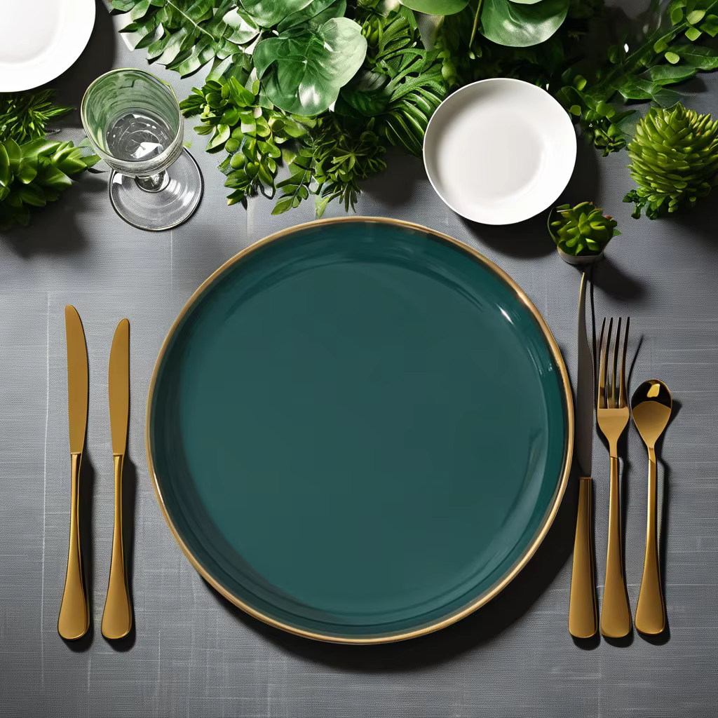
When it comes to table settings, bold ceramic plates really pop against those softer, muted tones. Try pairing that deep cobalt blue dinner plate with something simple like white porcelain bowls or maybe even gray chargers underneath. The contrast makes all the difference. There's this kind of rule about colors taking up about a third of what we see at the table, which somehow just looks right. For extra depth, bring in some texture through neutral elements. Think about swapping out regular cloth for linen napkins or going with flatware that has a matte finish instead of shiny silverware. These small touches create a richer experience without overwhelming the eye.
Apply the 60-30-10 rule to structure your table’s color scheme: 60% dominant neutral (e.g., ivory linens), 30% secondary tone (like sage runners), and 10% accent from your ceramic plate. A mustard-yellow plate becomes a striking focal point when framed by beige placemats and olive-green glassware.
Pair minimalist monochrome sets (all white or gray) with a single bold ceramic plate per place setting to create intentional visual drama. This approach suits modern aesthetics, directing focus to appetizers or desserts while preserving a clean, uncluttered look.
Elevate multi-course meals by changing ceramic plate colors between courses. Serve salads on crisp white plates to highlight freshness, then transition to rich burgundy plates for meat courses to enhance savoriness. This subtle shift cues guests to engage mindfully with each stage of the meal.